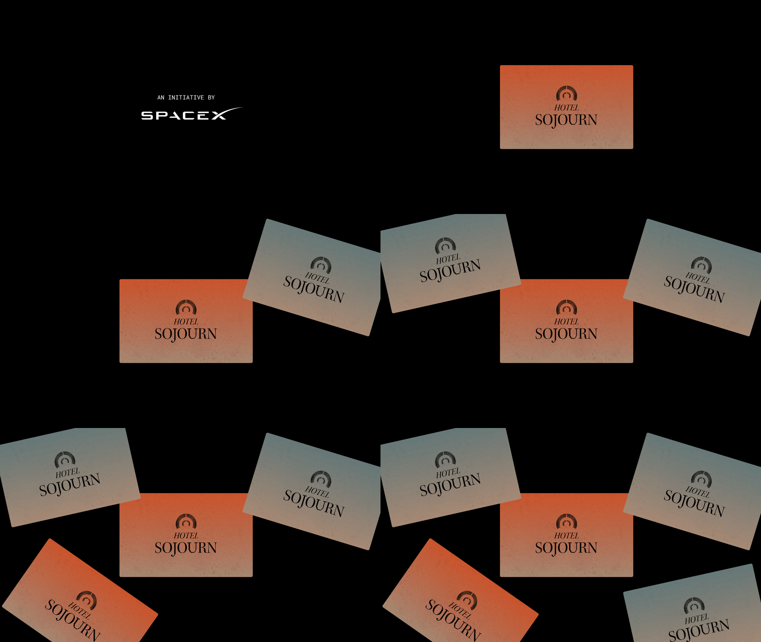
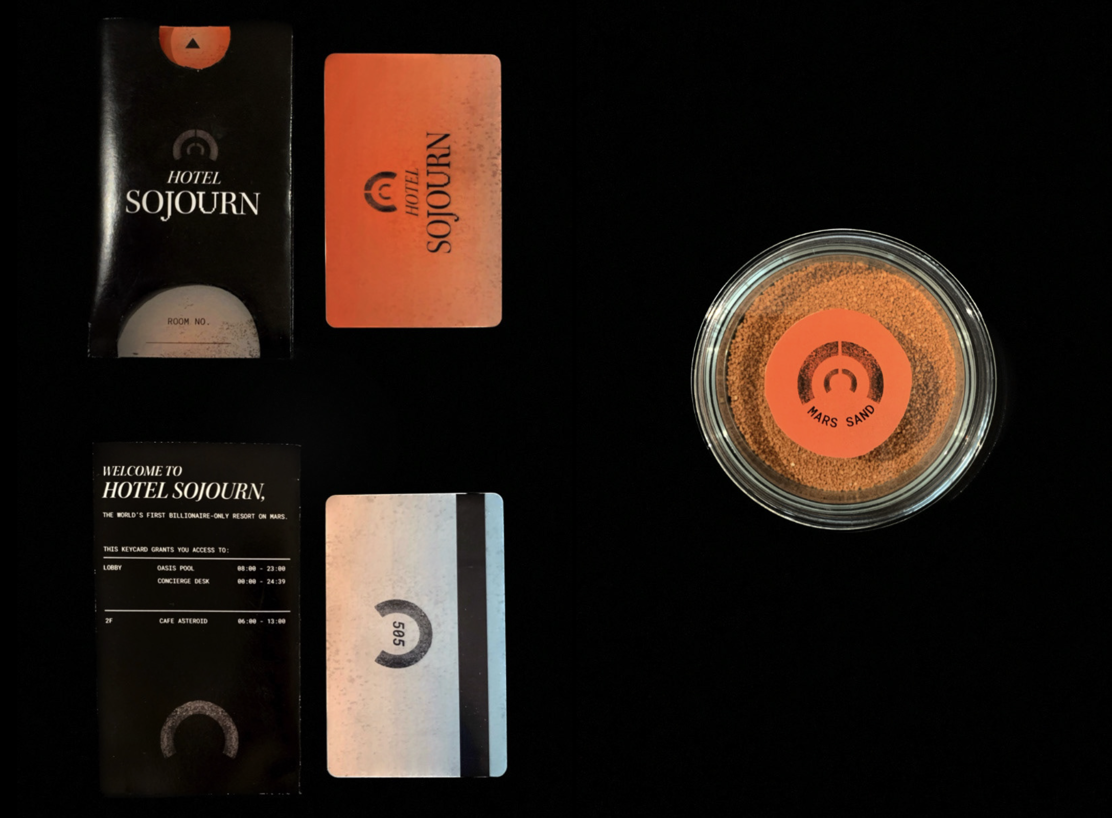
4 items were created for this project - an interactive webpage, Hotel Sojourn merch, a room keycard and an accompanying card cover.
Hotel website
Hotel merch
Background of the Hotel:
Hotel Sojourn is set on Mars since it is the most habitable planet. To keep things relatively realistic, this project is set in the year 2050, which is not too far off from now. This made it slightly easier to predict and imagine what the future would be like.
I started off by doing research about the different motivations behind space travel and quickly realised that each billionaire has a different perspective and vision for humanity's future in space. Since Elon Musk is currently running SpaceX with the vision of colonising space, I set Hotel Sojourn as an endeavour started by SpaceX. In this scenario, SpaceX would likely be running these hotels as a preliminary test for short-term stay (befitting of the name Sojourn), before delving into longer modes of stay in the future.
Visual Identity
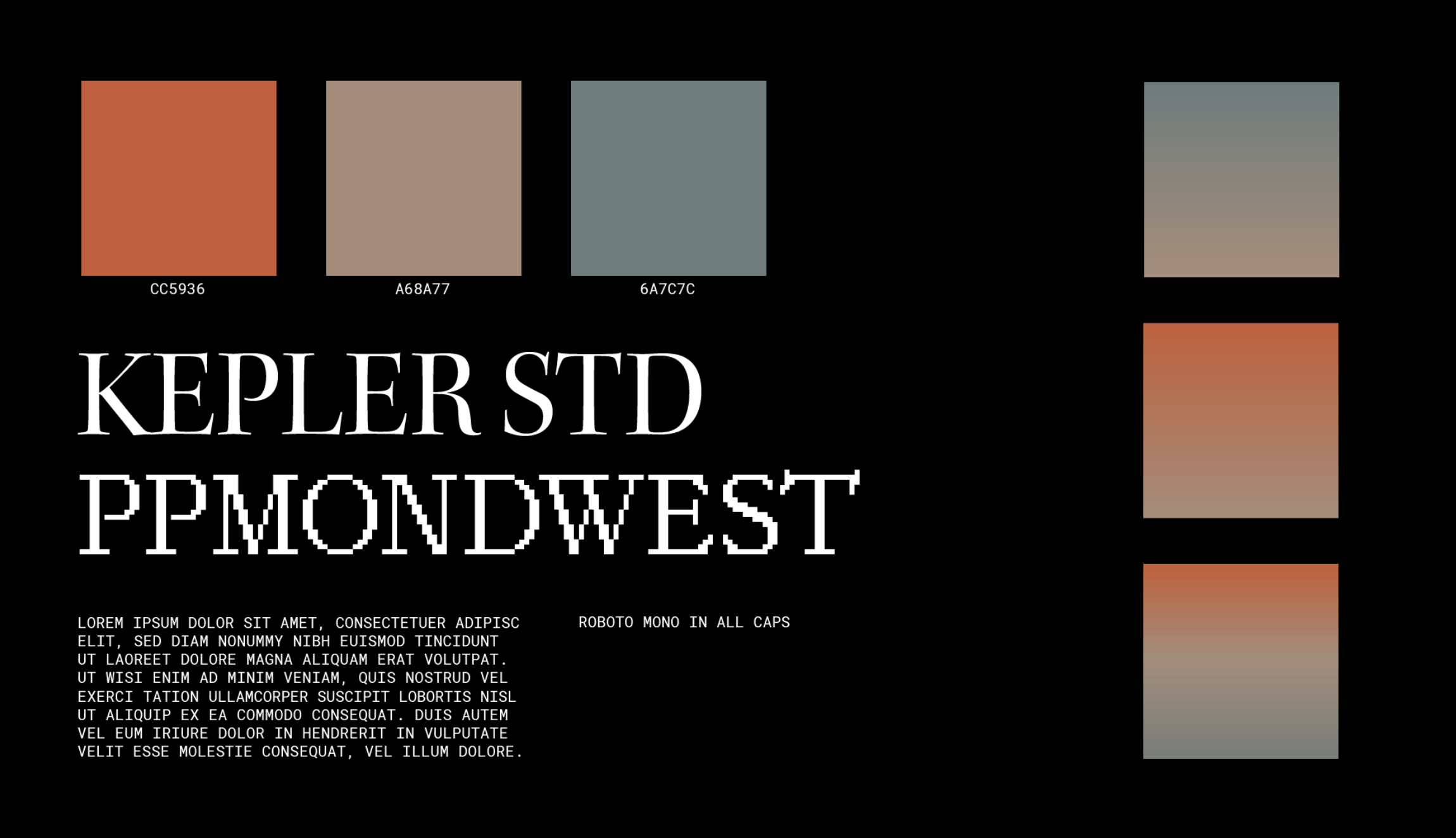
The colour palette was inspired by the colours of Mars, Earth and the moon, since these are the 3 planets that would be referenced the most in the hotel website.
Kepler and PPMondwest were used together as the main typeface for the hotel. Kepler was chosen because of its connections to astronomy, PPMondwest was chosen for its futuristic, digital look. Roboto Mono was chosen for the body text. All body text are in all caps based on the assumption that using only capital letters would be clearer for a computer to do character recognition.

Old ink and water were used to create various watercolor textures. These were later scanned and overlayed onto different assets to create the texture of Martian land. Some were also inverted, resulting in a starry look when placed against a dark background.
Visual System
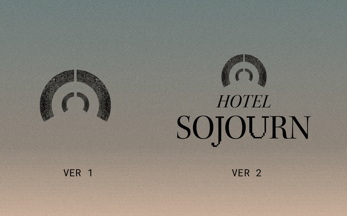
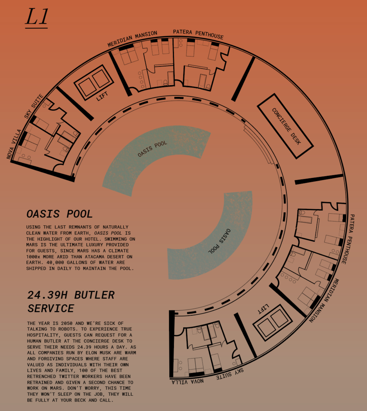
The logo is a simplification of Hotel Sojourn's dome-like structure (top and side view), which can be seen from the blueprint on the website.
I envisioned Hotel Sojourn to have a dome-like shape because houses in outer space are often designed without right-angles. Such corners would not be able to withstand the air pressure within the building.
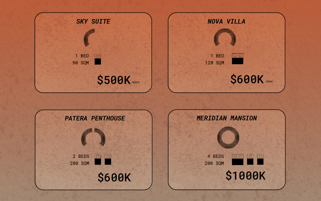
This visual language was extended to the 4 types of room a guest could stay in. The shape would be printed along with the room number on the hotel keycard and card cover. This creates a clear visual system for hotel staff and guests to quickly identify the type of room being used.