Details
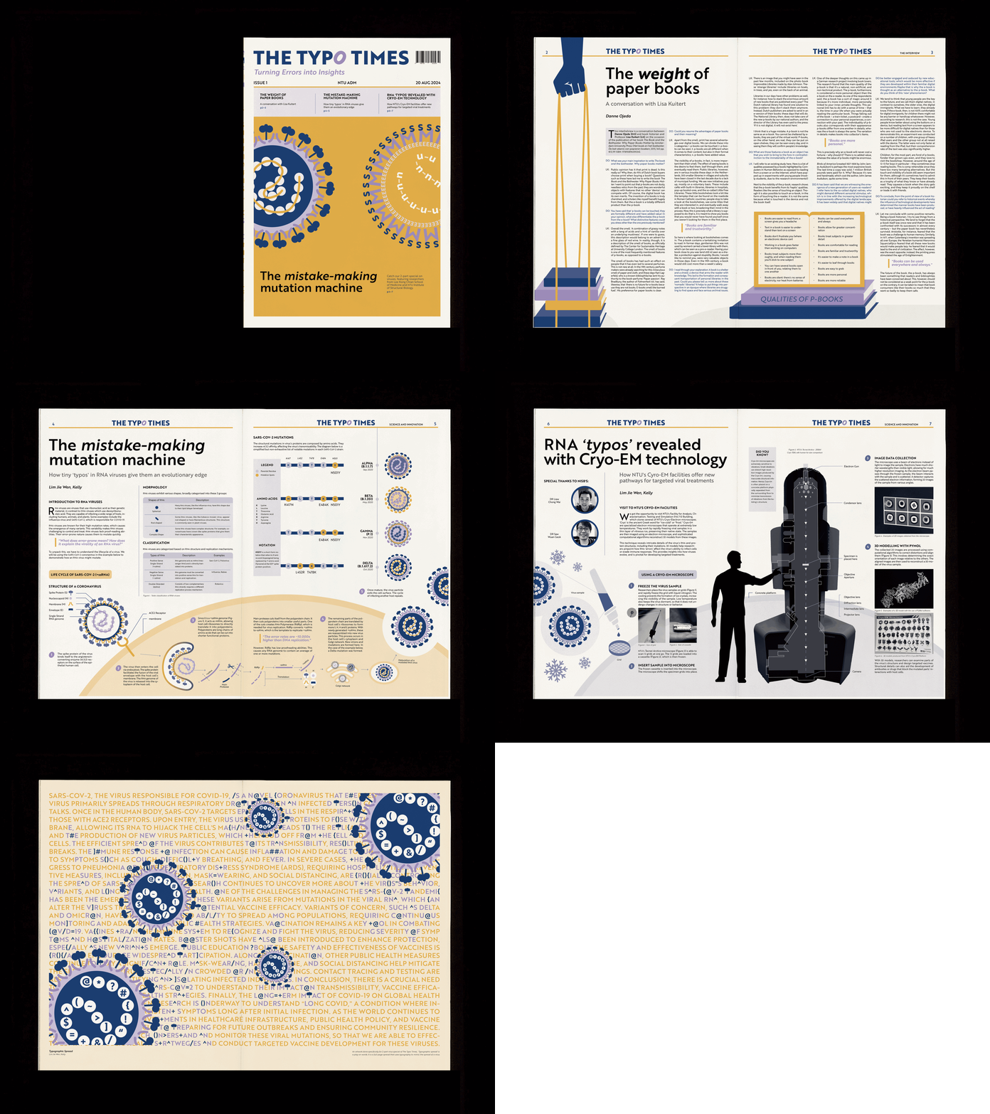
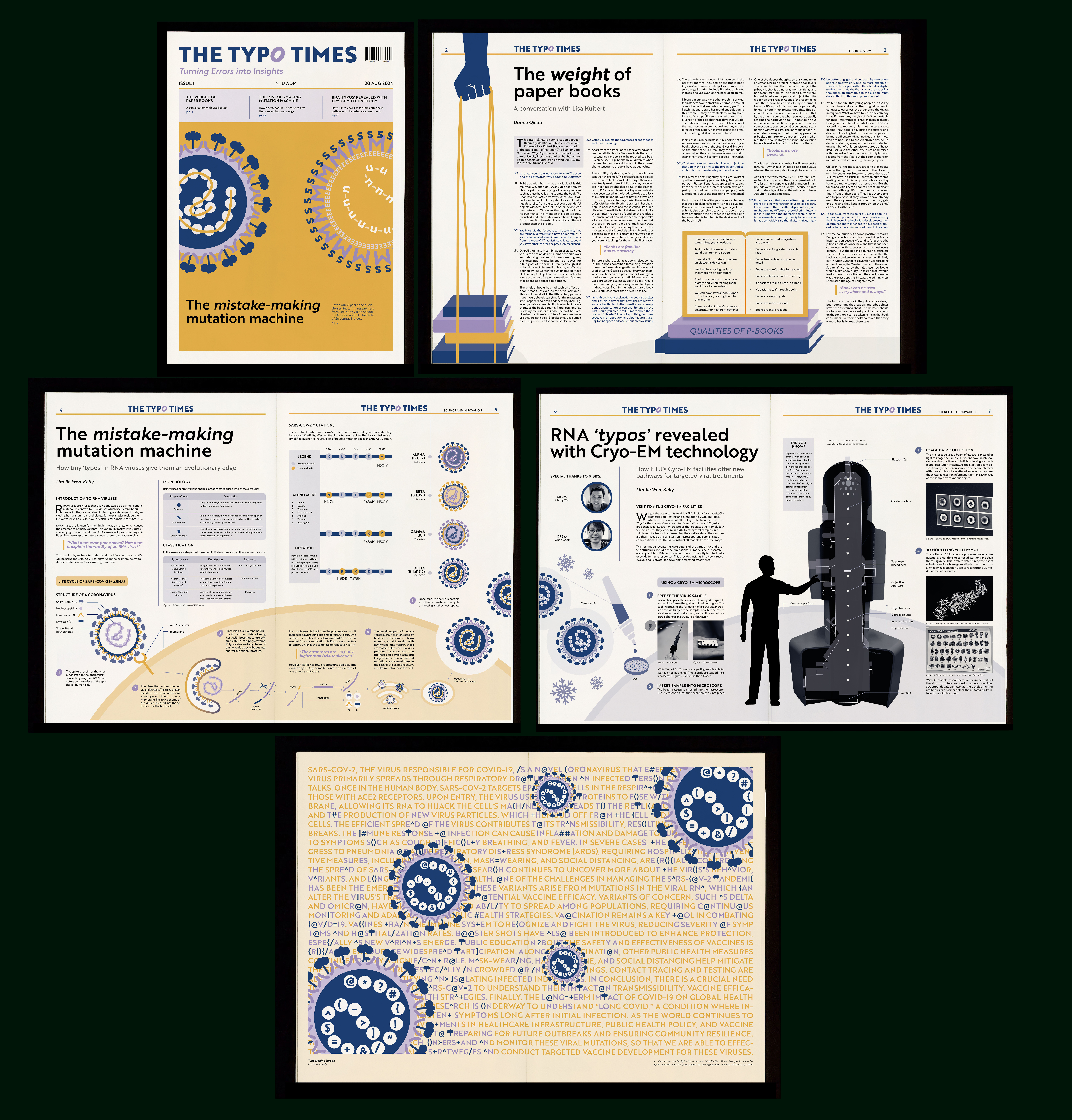
This A3 newspaper was printed with 100g/m² RJ Maple White paper.


Connecting Spreads
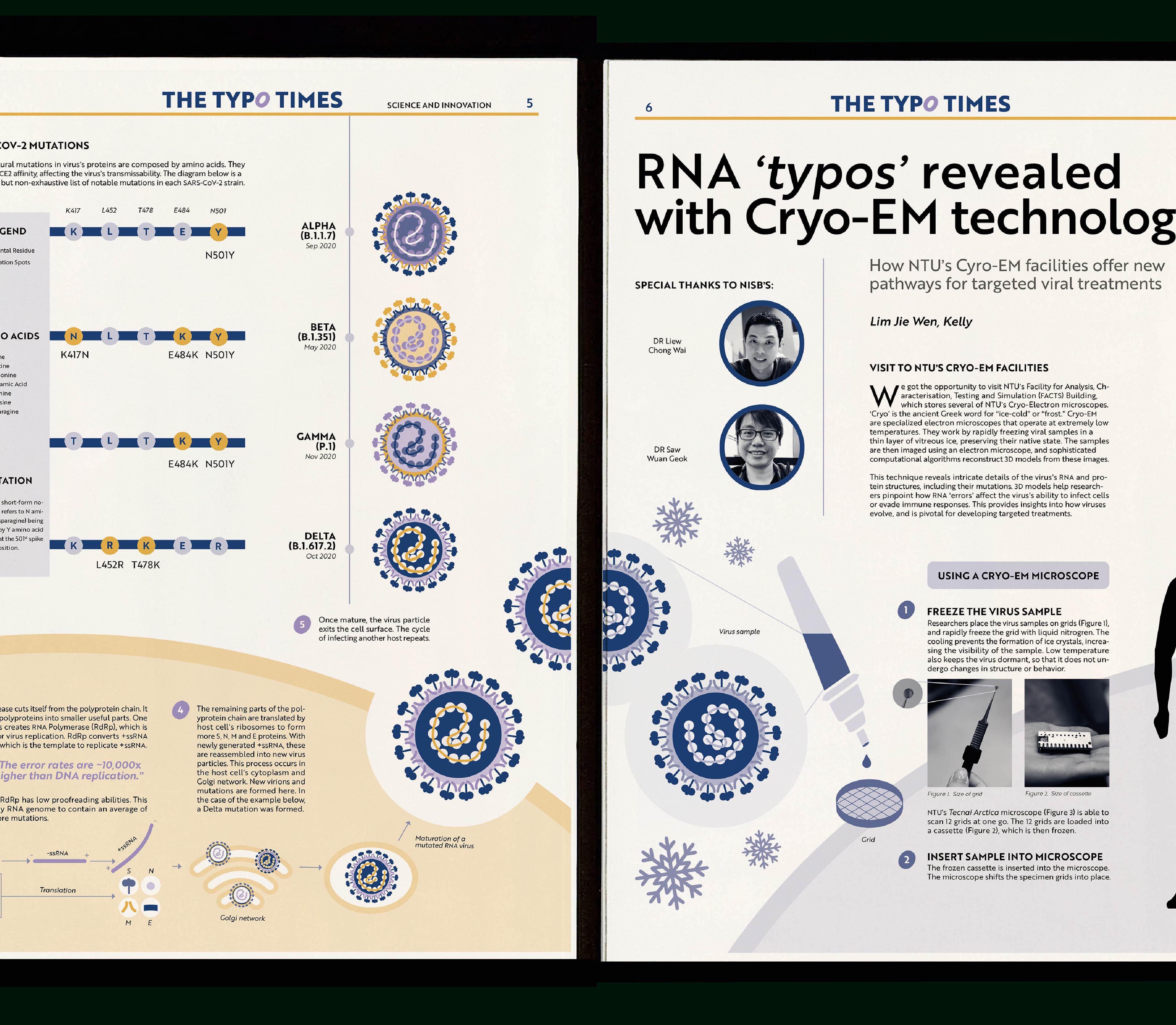
For the 2-part special on RNA viruses, I was tasked to come up with a way to connect the spreads. I extended a RNA virus illustration and had it exceed the margins. When the reader flips the pages, the illustration carries on, giving a sense of continuity.
As the reader continues to the third spread, the overall color scheme of the spread changes from a warm tone yellow to a colder, duotone blue and black befitting of the Cryo theme.


Artwork
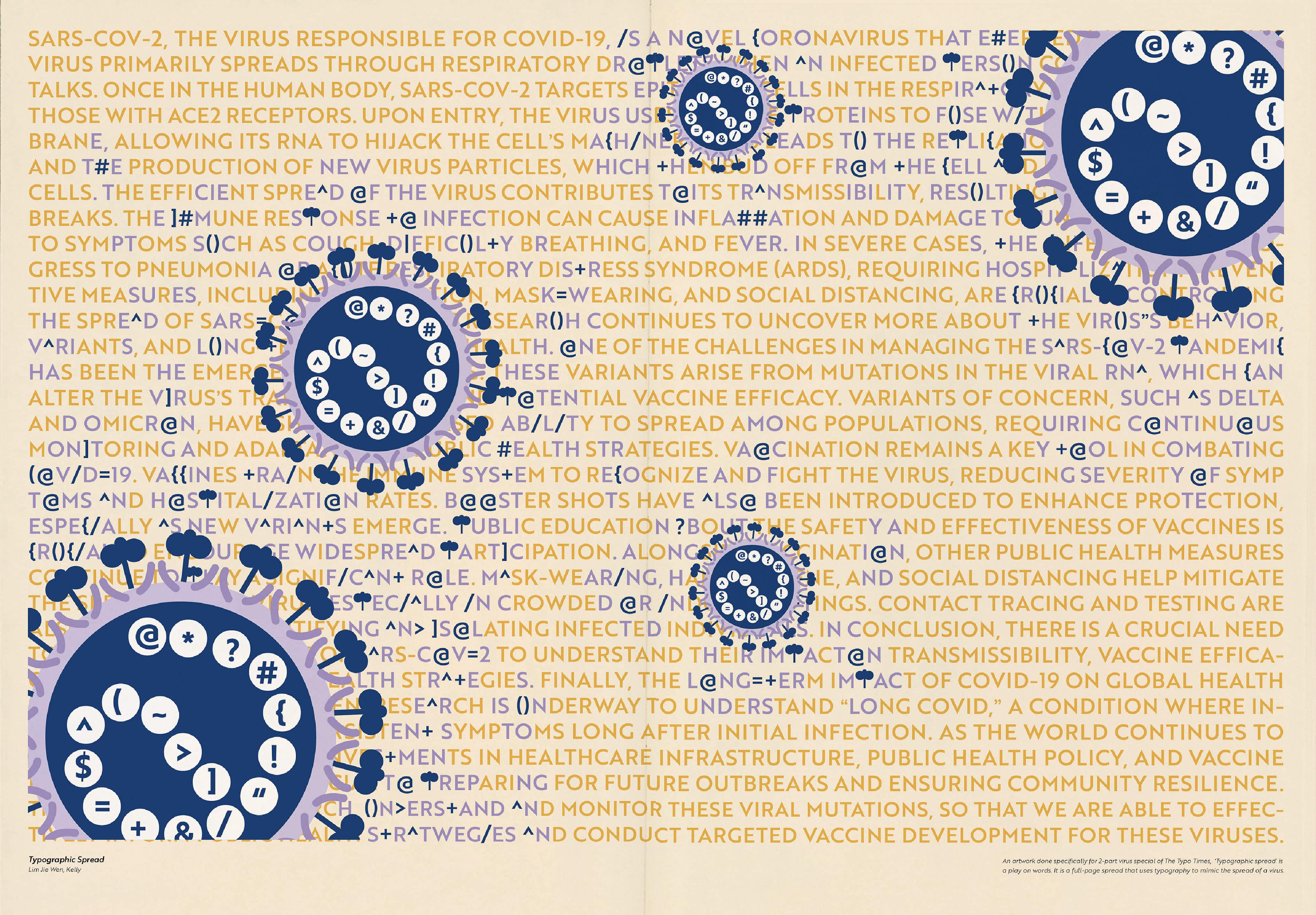
For the final spread, we were asked to create a full-spread artwork. In line with the typographic theme of the newspaper, I tried to express a virus spread typographically.
Typographic Spread features a virus taking over a paragraph of text, disrupting its legibility. Similar to how a virus is able to take over cells in our body to produce more virus genomes, the original body of text ceases to function.